UX / UI / Product Thinking
Designing systems that reduce cognitive load and support real people in real contexts.
My UX work comes from lived experience — designing tools for people managing complex routines, fluctuating abilities, and high-stakes daily tasks. I approach interfaces the same way I approach games and worlds: through systems, empathy, and iteration.
Below are two projects that show how I think, how I design, and how I adapt solutions to the constraints of real users, real devices, and real environments.
Primary Case Study — Prescription Management System
(Name withheld for privacy)
Overview
A mobile app designed for an individual managing a complex medication routine across multiple pharmacies. This was a real, high-stakes problem: fluctuating energy, cognitive load, inconsistent refill cycles, and the risk of missed doses.
The system includes a full-featured primary app and a lightweight companion app for trusted supporters.
The Problem
The user's daily routine involved 8+ prescriptions, multiple pharmacies, shifting schedules, and limited attention bandwidth. Existing apps assumed stable devices, high medical literacy, and perfect adherence.
The challenge was to create a system that adapts to the user — not the other way around.
Research & Insights
- Real-world observation of daily medication management
- Competitive analysis of accessibility-focused apps
- Identification of friction points in reminders, refill tracking, and cognitive overload
- Recognition that support networks play a critical role in adherence
Key Insight
The interface needed to flex with the user's cognitive state, device performance, and real-world constraints.
Design Approach
- Mobile-first wireframes to establish clarity
- Iterative prototyping with 15+ rounds of feedback
- Cross-domain inspiration from design systems and natural-language tools
- Accessibility-first decisions (contrast, touch targets, screen reader support)
- Offline-first architecture to support unreliable connectivity
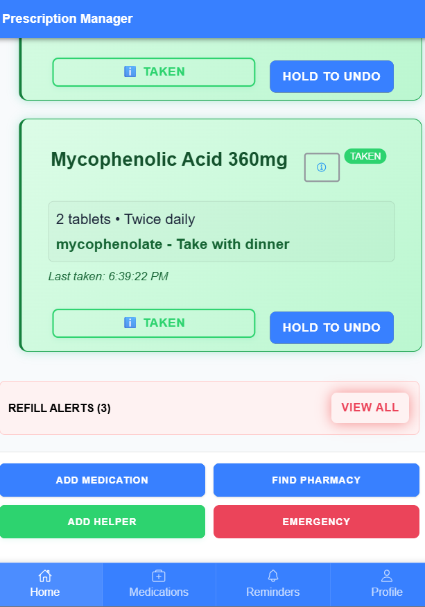
Key Features
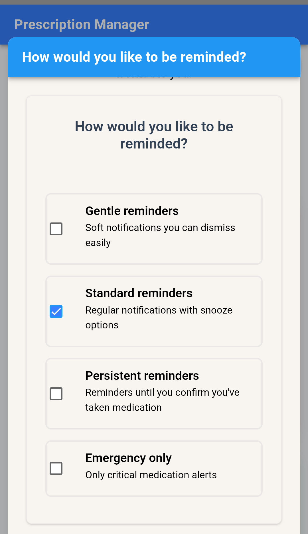
- Medical Personalization Engine — Complexity slider adapts UI density to the user's cognitive load
- Device Tier Adaptation — Scales visuals and features from low-end to high-end devices
- Thermal-Responsive Layout — Simplifies UI automatically when the device overheats
- Visual Weight System — Prioritizes life-critical information over supporting detail
- Progressive Disclosure — Basic vs. advanced modes for cognitive flexibility
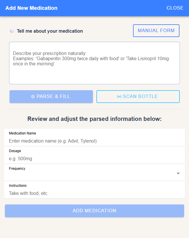
- Conversational Setup — Natural-language input for schedule and reminder creation
- Caregiver Access System — Role-based permissions for real-world support networks
Helper App — Companion Experience
A lightweight secondary app for trusted supporters. It receives missed-dose alerts, syncs with the primary user's reminder settings, and stores no sensitive data. Designed for low-end devices and minimal cognitive load.
Impact
- Improved adherence (self-reported)
- Zero missed critical medications since launch
- Reduced caregiver stress
- Reliable performance on low-end hardware
- Fully functional offline
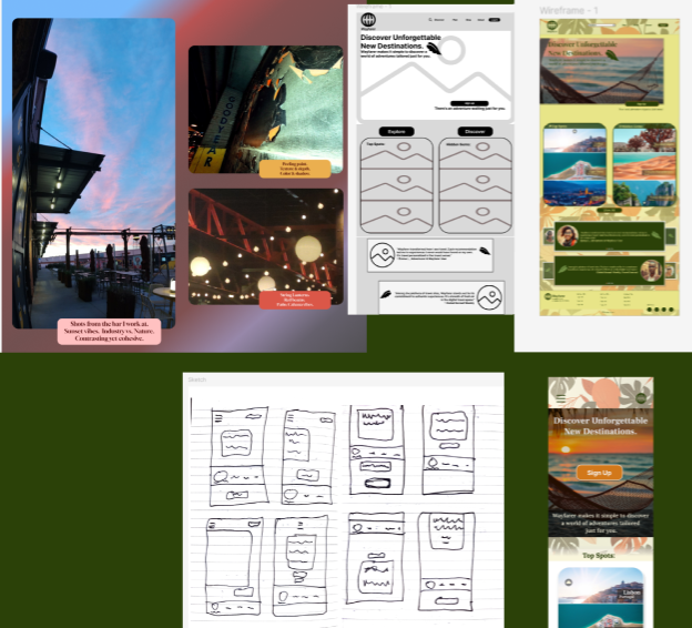
Secondary Case Study — Responsive Travel Service Redesign
(Course project — original branding removed intentionally)
This project demonstrates foundational UX skills — mobile-first wireframing, responsive layout design, and basic design system creation.
Overview
A 6-week mentor-guided UX/UI foundations course focused on core design skills: user research, wireframing, interaction design, usability testing, and accessibility.
The capstone assignment was to redesign a travel-planning service across mobile and web, improving clarity, navigation, and overall usability.
The original brand assets have been removed to keep the focus on the design process rather than the assignment's fictional company.
The Problem
The provided travel service had several issues common to early-stage products:
- Unclear navigation structure
- Inconsistent visual hierarchy
- No mobile-first strategy
- Scattered information architecture
- Weak call-to-action placement
- Accessibility gaps in color contrast and touch targets
The challenge was to create a cleaner, more intuitive experience that supported both quick trip planning and deeper exploration.
Research & Insights
- Informal user interviews
- Heuristic evaluation of the original design
- Competitive analysis of modern travel apps
- Identifying friction points in the booking flow
Key Insight
Users wanted clarity and momentum — fewer decisions upfront, clearer paths to action, and a layout that adapts to different device sizes.
Design Approach
- Mobile-first wireframes to establish hierarchy
- Iterative layout exploration in Figma
- Early usability checks with peers
- Refinement of navigation and content grouping
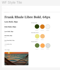
- Creation of a simple design system (colors, type, spacing)
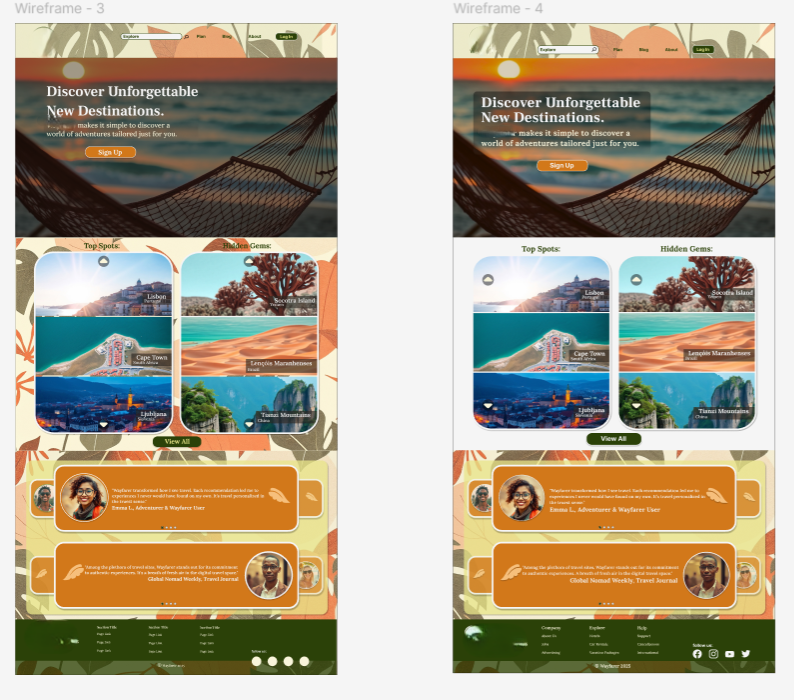
- Responsive web layout built from the mobile foundation
Solution
The final design introduced:
- Simplified navigation with fewer decision points
- Consistent visual hierarchy across screens
- Accessible color palette and improved contrast
- Larger touch targets and clearer spacing
- Streamlined booking flow
- Responsive layouts for mobile, tablet, and desktop
The result was a more intuitive, approachable interface that supported both quick actions and deeper browsing.
Tools
Figma — FigJam — Photoshop
Visual assets available on request — screens shown without original branding.